
Understand Logical Data Model
LDM in Detail
Where Do You Find the LDM?
There are several places where you can display and/or modify the LDM in GoodData.
The primary place where you can see the whole LDM is the LDM Modeler, which is part of the GoodData application. To access it, open the Data tab on the top bar.
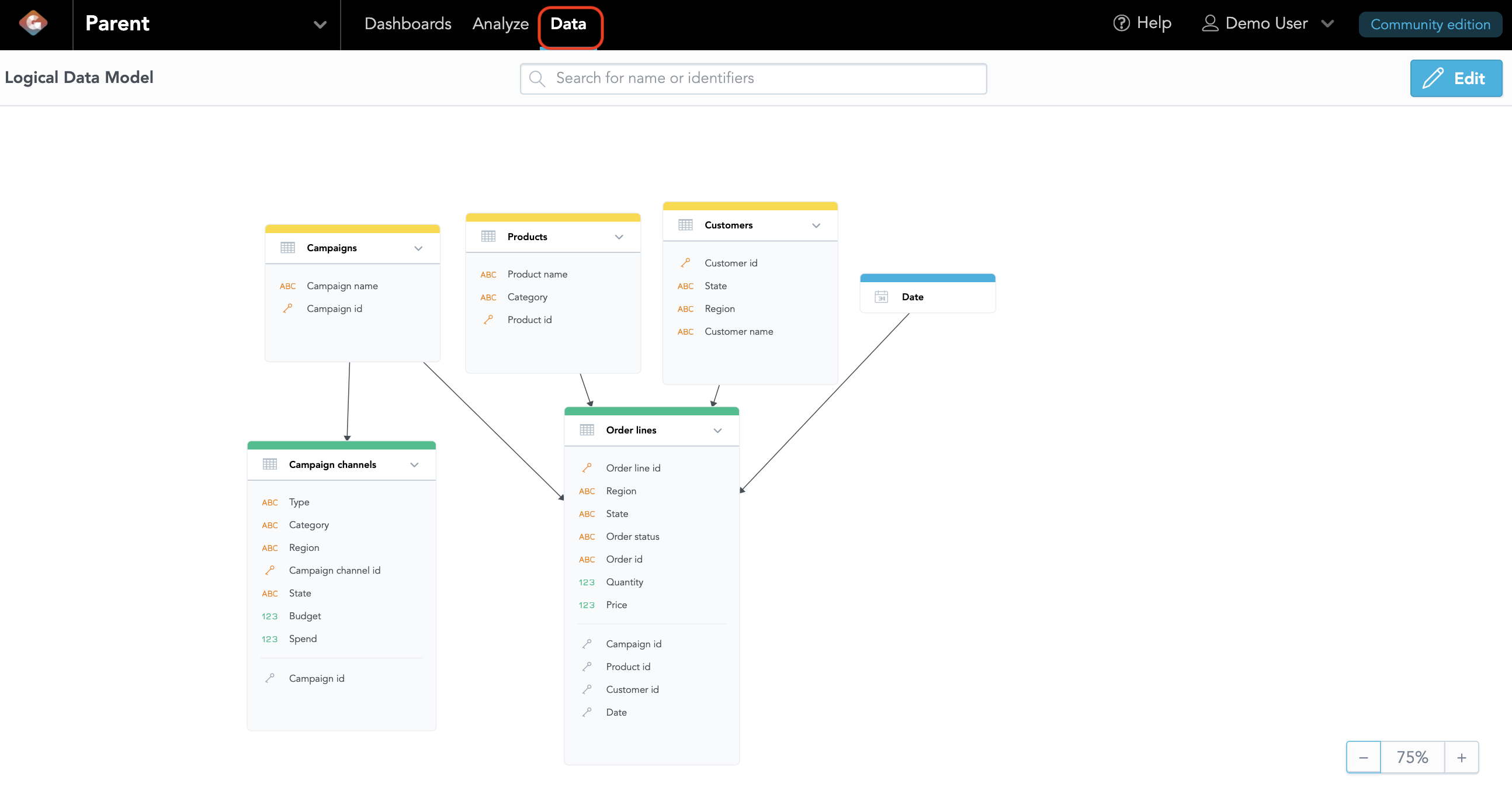
There, you can view the current logical data model of that particular workspace. Note that if the workspace has just been created, the model will be empty. In this course, we will not be making any changes to the LDM, so for now, we’ll just take a look. To learn more about using the data modeler, you can review the articles in the documentation.
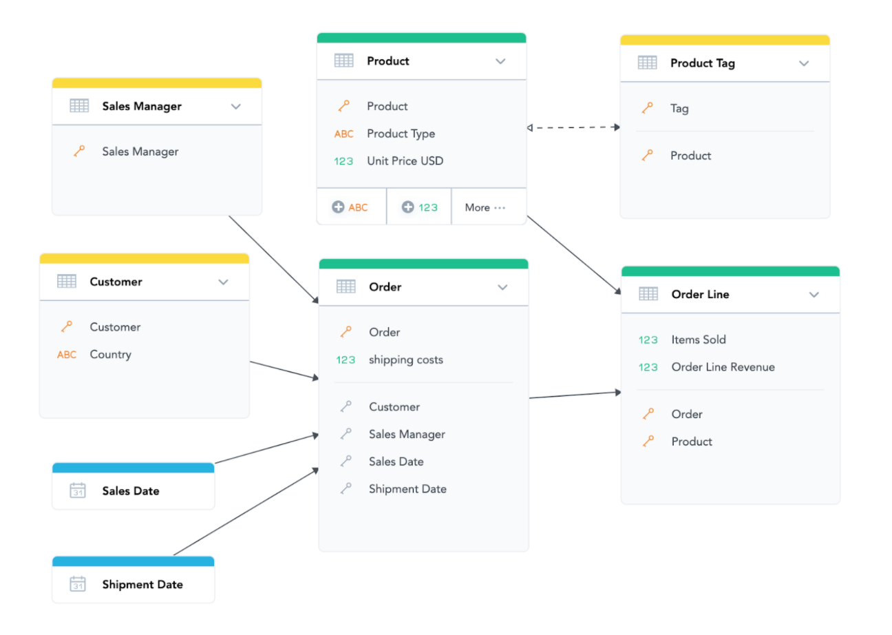
This is how our example LDM of Acme sales data would look:
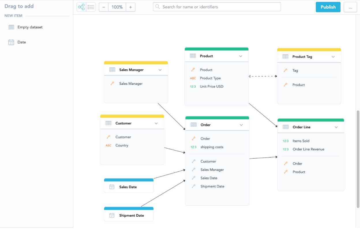
We’ve seen it before, but now let’s take a more detailed look and describe the components of the logical data model.
LDM Components
The LDM in GoodData consists of several types of objects. Let’s introduce them one by one using the Acme data model from previous chapters:
Dataset
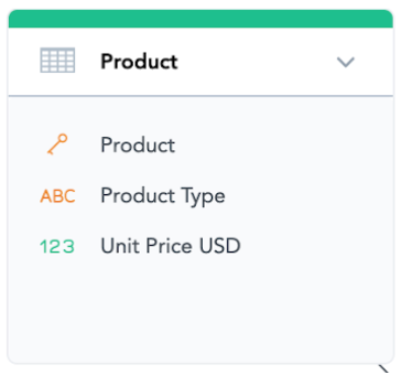
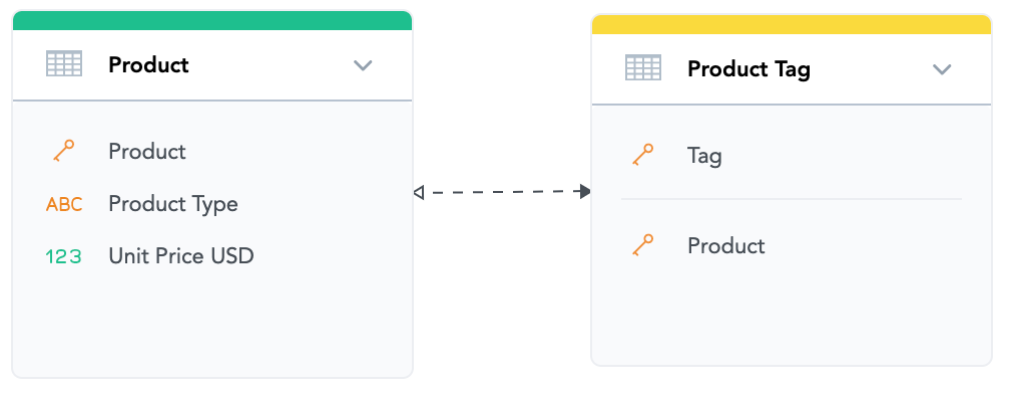
The boxes with green and yellow headers are called datasets. For example, “Product” is a dataset. You can think of each dataset as a database table.
In GoodData Cloud, each dataset translates to a single database table. While it is good practice to have a single field in the table that can map to each corresponding dataset column, there is no requirement to provide data for all columns. Each database table column may be mapped to 0, 1, or multiple dataset columns.
The color of the box header (green or yellow) depends on whether this dataset contains a fact (see below) or not. Datasets with facts are marked green; those without any facts are marked yellow. This is purely a visual distinction, as there is no difference in how yellow and green datasets work. Boxes with blue headers are called Date Dimensions (see below).
Facts

Facts are displayed as lines with the “123” icon within datasets. If you think of a dataset as a table, think of a fact as a column, or more specifically a column with a numerical value in it. Facts are things like measurements, amounts, and sizes. You can perform calculations with facts in GoodData—i.e., aggregate them or add or multiply them. These calculations are called measures or, in some older texts, metrics.
For example, “Unit Price USD” is a fact in the Product dataset and represents the current standard price of a product. “Shipping Cost” is a fact in the Order dataset and represents how much shipping cost for that particular order.
Attributes

Attributes are displayed as lines with the “ABC” icon (or sometimes the “key” icon) within datasets. Similarly, as with facts, you can think of an attribute as a column in a dataset. More specifically, an attribute would be a column with a categorical value (i.e., product name, color, status, age range, etc.). It typically has some text value and gives context to facts.
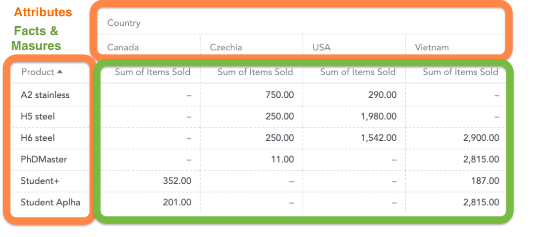
Attribute values are used for slicing and filtering insights and measures (i.e., they are put into the header of a pivot table), while facts are mainly used in measures and cannot be used for slicing. For example, “Product Type” is an attribute of the “Product” dataset, and “Country” is an attribute of the “Customer” dataset. You cannot perform any mathematical operations on attributes with the exception of counting.
In the following pivot table, there are two attributes (“Country” and “Product”) in table headers and a fact “Items Sold” (in the form of a SUM measure) inside:
Attribute Labels
In most cases, one attribute truly translates to one column in the dataset. In more advanced data models, though, one attribute can be represented by multiple columns of data. This happens in two types of situations:
- The attribute needs to support special functionality—i.e., it needs to contain GPS coordinates information to be displayable on geo charts or it needs to contain URL information to be clickable. Note that geo charts are currently unavailable on GoodData.CN.
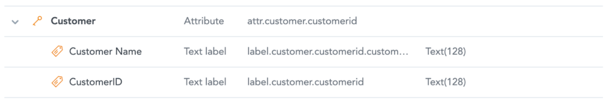
- The attribute—for example, “Customer”—has a unique identifier (Customer ID) but also a human-readable name (Customer Name). You want to use the ID to reliably identify individual customers—since sometimes they can have the same name—but still want to be able to display the human-readable name in the insights.
The different columns that represent the same attribute are called attribute “labels,” and they appear as separate columns during mapping connections for GoodData.CN between datasets and database tables. They are not visible in the standard model view, but they can be displayed in the detailed view of each dataset. You can access this by hovering over a dataset, clicking on “More …,” and selecting “View details.”
Labels can be useful when building more advanced data models or working with GoodData SDKs, but if that is not the case for you, then you do not need to worry about them for now.
If you want to learn more about labels, refer to our documentation.
Primary Keys and References
Datasets in GoodData can (but do not have to) have what is called “primary keys,” which refers to one or more columns that uniquely identify each row in the dataset. Primary keys serve two important purposes in GoodData:
- Referencing between datasets (only datasets with a single-attribute primary key can be referenced by other datasets)
- On GoodData Cloud, records from the database table will not be deduplicated in the analytics engine based on the primary key. It is the responsibility of the database admin to ensure no duplicates are present in columns designated as primary keys. Duplicates will not affect filtering, but may affect count measures on those key attributes.
Primary keys in the modeler are identified by an orange key icon.
There can be one such icon or multiple icons depending on whether that dataset has a single-attribute key or compound key, which can be a combination of attributes and references. References (also called foreign keys) are displayed in the datasets under the thin grey line. They usually have grey key icons unless they are a part of a compound primary key.
Any attribute or a reference that is marked as a part of a compound primary key automatically gets the orange key icon.
The “Order” dataset in the Acme model has a single-attribute primary key “Order” and four regular references, while the “Order Line” dataset has a compound key defined by two references: “Order” and “Product”.
Relationships Between Datasets
Relationships between datasets define how the datasets can be joined together. End users building insights do not need to write explicit database joins like in SQL; all joins are predefined within the LDM in advance.
Relationships are represented as arrows between datasets. A one-way
arrow means a one-to-many relationship (note that in GoodData the arrow goes from the dataset with the primary key to the dataset with the foreign key, which is the opposite of other tools). Two-way arrows are also possible in GoodData under some circumstances, and they represent a many-to-many relationship.
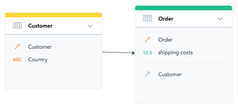
In our sample model, there are several relationships. For example, the one between “Order” and “Customer” datasets. The arrow goes from Customer to Order, which means that each order needs to have exactly one customer. You can also see that there is a Customer column in the Order dataset with a grey key icon under a thin line, which is the foreign key that references the primary key of the Customer dataset.
Note that the arrows in the diagram point between datasets generally, and they do not necessarily point to a specific attribute or foreign key—though it may appear that way.
The relationship between “Product” and “Product Tag” is an example of a many-to-many relationship where each product can have multiple tags, and each tag can be assigned to multiple products. Such a relationship is displayed as a two-way dashed arrow.
Date Dimensions
Dates have a special role in GoodData and are represented by date dimensions. Technically, they are also datasets, but they are already prepared for you with their inner structure. You connect a date dimension to your dataset by a reference (like you would connect any other dataset). Each date dimension contains a standard calendar with days ranging between 1900 to 2050 and can be loaded with customized content (like a fiscal calendar) if needed. Date dimensions also get into time granularity (down to Minute).

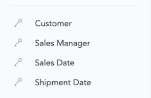
Date dimensions are represented by boxes that are marked blue in the modeler. In our sample data model, we have two date dimensions—Sales Date and Shipment Date—and they are both referenced from just one dataset: Order.
To learn more about date dimensions, refer to the documentation.
Where Are LDM Components Used?
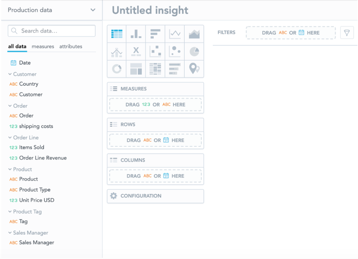
You will see some of the components we have just described not just in the modeler but also in other places in GoodData. The most prominent one is the Analytical Designer tool (the Analyze link in the main navigation) in which you can build insights.
The catalog on the left side contains objects from the LDM: attributes (with the “ABC” icon), all the date dimensions hidden under the “Date” object, and facts with the “123” icon. Depending on your settings, the objects can be categorized into folders by datasets.
Note that in Analytical Designer, both facts and measures, which are calculation expressions written in GoodData’s analytical language (MAQL), are simply called “measures,” and the “123” icon is used for both.
Another place where you can meet objects from the LDM is Metric Editor, which is used for building measures, formerly called metrics, in MAQL. In Metric Editor, you can find the objects from the LDM (facts, attributes, labels) in the right column.
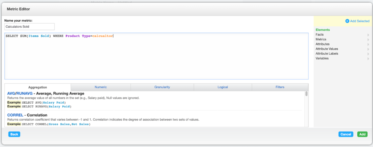
Please note that the Metric Editor is only available on the hosted GoodData Platform. On GoodData.CN, metrics need to be created via API.