Getting Started with GoodData Cloud
Create Visualizations
Visualizations are the visual representation of user’s data put into different contexts.
Visualizations are created using facts , metrics , attributes , and optionally filters that are combined in a way to visualize a particular aspect of your data.
At first, you will be working with visualizations in the Analytical Designer. The Analytical Designer is where you create and manage your visualizations. To learn more about it, see Analytical Designer in the documentation.
Creating Visualizations
Summary
To create your first visualization:
-
Select the Analyze tab in the top navigation bar to navigate to the Analytical Designer.
-
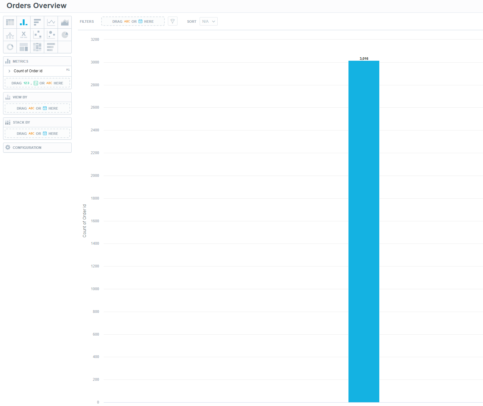
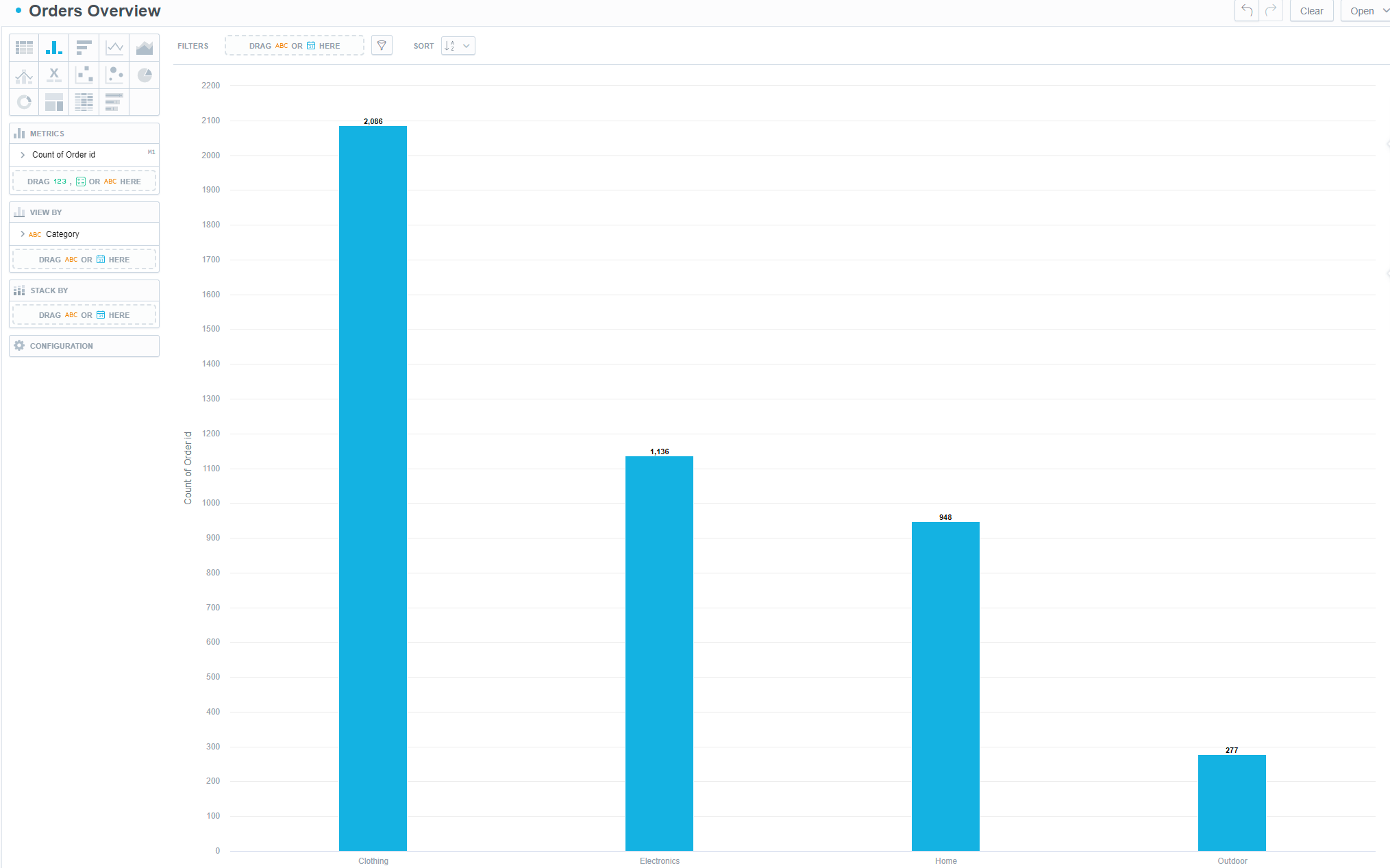
Click on Untitled insight to name your visualization. In our example, we went with Orders Overview.
-
Click on the Column Chart icon.
-
Drag and drop the Order id attribute onto the Metrics panel.
-
Drag and drop the Category attribute onto the View By panel.
-
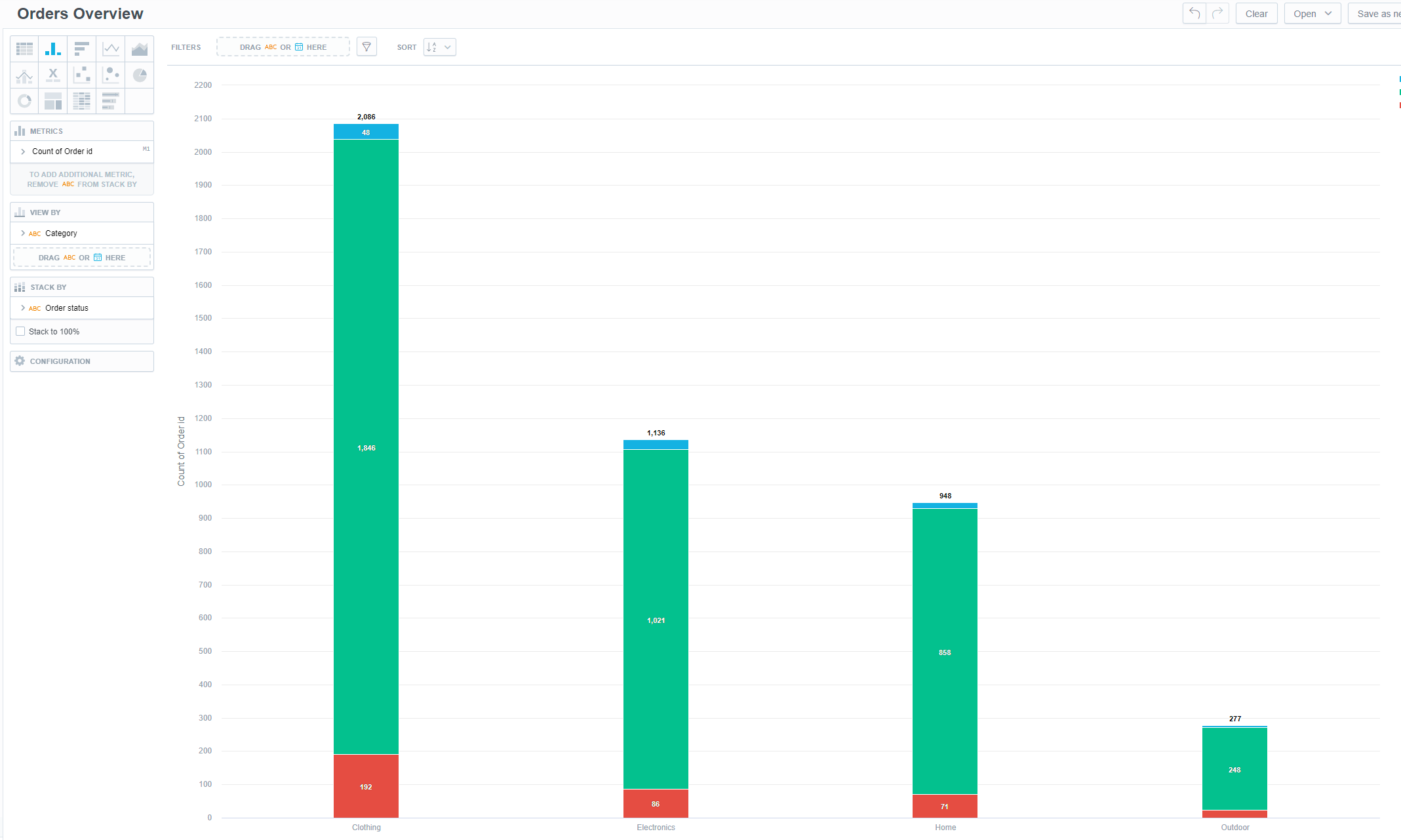
Drag and drop the Order status attribute onto the Stack By panel to view the data in more detail.
-
Save your insight with the Save button in the top-right corner.
Good job! You have created your first visualization!