Getting Started with GoodData Cloud
Create Metrics
You have used attributes and facts to create your first insight. Now let’s look how you can go a step further and create custom metrics!
But first, what are metrics? A metric is a computational expression of numerical data, created through a combination of facts, attributes and mathematical functions.
Confusing? Let’s look at a few simple examples of a metric:
'Order Amount' <- SUM(Quantity * Price)
The metric 'Order Amount' gets the total value of all ordered products by multiplying the quantity of ordered products by their price and summing them all up.
Creating your first Metric
Summary
To create a metric:
-
Switch to the Metrics tab.
This opens up the Metric Editor. You will be using the Metric Editor to create new metrics and update all the existing ones.
-
Click the Create metric button.
This will open up the metric editor dialog.
-
Give your metric a title. In this example, we went with Order Amount.
-
Type in
SELECT SUM (Price * Quantity)and click Save.As you can see, the Metric Editor does not recognize the Price and Quantity as facts, so you need to update the metric.
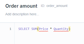
You can either start typing Price again and then select an option from the code-hinting, or you can type
{fact/price}. Note, that the ‘p’ in price is not capitalized. -
Repeat step 4. for the Quantity fact.
-
Click Save.
Good job! You have created your first metric.
Visualizing Metrics
Summary
Now that you have your first custom metric, let’s put it to use in the Analytical Designer!
To visualize your custom metric:
-
Switch to the Analyze tab.
-
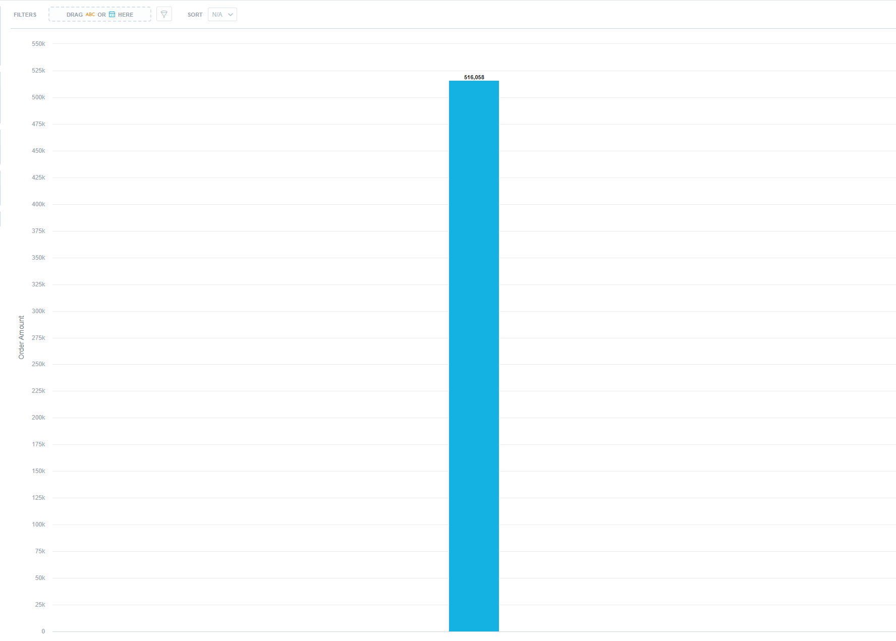
Switch the type of visualization to Column chart.
-
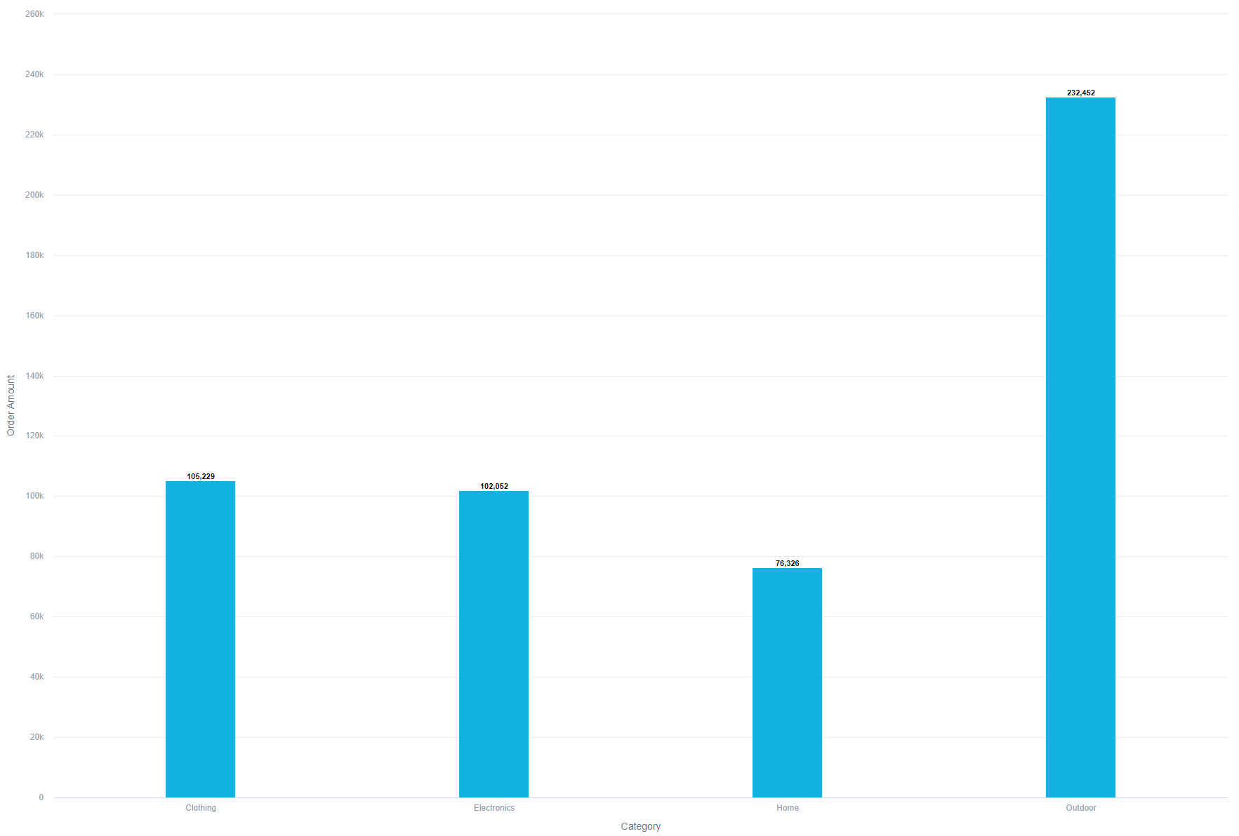
Drag and drop your new metric Order Amount from the data catalog into the Metrics panel.
-
Drag and drop Category on the View By panel.
-
As a finishing touch, drag and drop Order Status to the stack by, so you can directly compare it to the first visualization you have created.
-
Now click Save.
Notice, that when you don’t name you Visualization, a prompt pops up for you to name it. Let’s name this one Order Amount by Category.
Good job! Now you know how to visualize your custom metrics!